Extremely Geeky
OKTO is now EXTREMELY GEEKY

Rebranding is often a risky business and is usually much more than just a revamp of your logo or business name, but sometimes you can't avoid having to rebrand your business and choose a new name. This was the situation I found myself in with my own business...
The OKTO / Extremely Geeky Rebrand
I've been trading under the name of OKTO for nearly 5 years, but due to new rules by the Australian Business Register I had to register an official business name. Unfortunately the OKTO name got snapped up before I even had a chance to look, so I was forced to choose another one. A few years ago I had registered extremelygeeky.com for a personal project that never got started. Since what I do for a living is pretty geeky, the new name fit perfectly.
The Logo Change
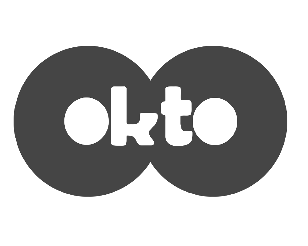
The OKTO logo and name was based around the number 8; chosen for its lucky connotations and the connection to the fact that I first arrived in Australia in 2008. I was playing around with the concept of the number 8 being incorporated into the logo design, and it wasn't until I rotated the number ninety degrees that I instantly saw the OKTO name. I really liked the symmetry, simplicity and iconography of the logo, so it was certainly a keeper!
The OKTO name always had a small problem, though: I had to spell it out whenever I told someone my website address or my email address over the phone. It was something that I hadn't originally anticipated although fortunately, the name was pretty short, so it wasn't too much of an issue. Despite that small problem, the logo and name had worked well for me over the years, so I wanted to keep some semblance of the symmetric concept in my new Extremely Geeky logo.
The Extremely Geeky name isn't very symmetrical by itself. I was working with circles in photoshop, scratching my head, and wondering how I could work some sort of symmetry into the logo design. A circle became a power icon, and then my wife suggested that I rotate the icon ninty degrees, and it suddenly dawned on me that the sideways power icon could be used for both the E and the G of the Extremely Geeky name. It was a real eureka! moment, and the concept gave my new business logo the kind of weird symmetry that I really liked.
A New Brand is Born...
![]()
I decided to turn my new logo into a font and then, at the clever suggestion from my wife, Nikola, I added a little bit of JavaScript magic to make the power icons pulse with a green glow. A huge range of CSS effects meant that I could style the text in lots of different ways too, which makes it much more versatile than just a static image.


