Extremely Geeky
Taming Tables : Responsive CSS and JQuery tables

Twitter Bootstrap is an amazing open-source web framework for creating responsive websites. It does an excellent job of saving development time when templating for websites; having a myriad of functions and CSS classes for organising responsive content. When it comes to tables though, things can get tricky - and trying to tame long width tables for mobile devices can turn into a nightmare.
The Problem
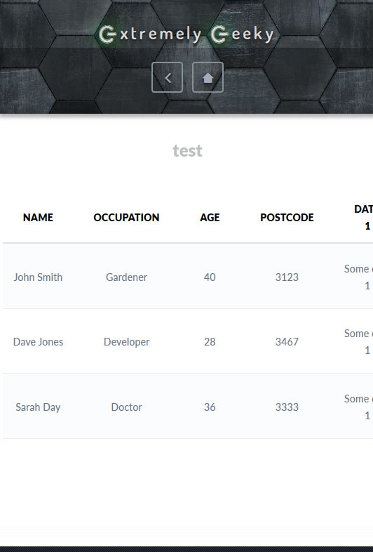
Wide tables with multiple columns can often be cut off horizontally on devices with small screens. This is because tables aren't responsive by default, and because of their structure and complexity, making them responsive can be quite a challenge.
Bootstrap does a pretty good job of styling HTML tables and making up to 4-column tables responsive above 600 pixels wide or so, but what we really need on a website is for a table to do the job it's intended for, and that is to present structured data no matter how many columns it might have, on all devices - including mobiles.
Fixing this problem often leads to another problem. The extra code to make tables responsive on mobile devices can often make tables more complex to implement and maintain, especially large tables.
Fixing The Problem
CSS to the rescue!
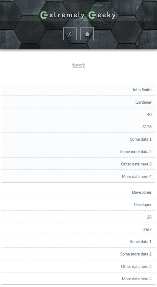
The following CSS code will work well for up to 8 column tables on smaller screen sizes. What it does is to remove the headings (we'll add them back later) and then collapse the columns into rows instead, and uses a little styling to seperate each data row into a visible block (of sorts), so that the user can understand the data a little better.
table {
border: 0;
width:100%;
}
table thead {
display: none;
}
table tr {
border-bottom: 1px solid #ddd;
display: block;
margin-bottom: 10px;
}
table td {
border-bottom: 1px dotted #ccc;
display: block;
font-size: 13px;
text-align: right;
}
table td:last-child {
border-bottom: 2px solid #ccc;
}
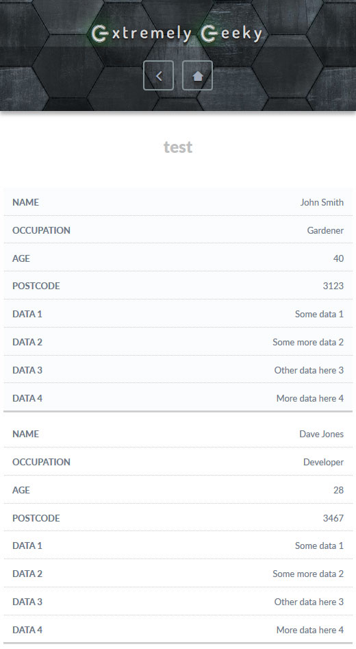
table td:before {
content: attr(data-label);
float: left;
font-weight: bold;
text-transform: uppercase;
padding-right:5px;
}
}
Adding back the heading titles with JQuery (1.11+)
Now we add a new class to the <table> element so that it looks like <table class="table">, and then we need to use the data-label attribute on each <td> element to add the headings back for each row. Rather than manually edit the table code, we can use a handy bit of JQuery to collect the headings and loop through the table data to add the attributes automatically.
<script>// <![CDATA[
// The array to fill with the table headings
var tableheadings = new Array();
// Function to clean up the table headings text
function cleanData(x) {
return x.replace(/(^\s+|\s+$)/g, '');
}
// Get the table headings and fill the array
$(".table th").each(function () {
var tableHeadingClean = cleanData($(this).html());
tableheadings.push(tableHeadingClean);
});
// Add the headings as a data-label attribute to each <td> element
for(var i = 0, l = tableheadings.length; i < l; i++){
$(".table td:nth-child(" + (i + 1) + ")").attr("data-label", tableheadings[i]);
}
// ]]></script>
I hope that this guide helps someone out there to tame their tables!


